Steps Towards More Inclusive Design
As developers, we often get requests for new features that may seem trivial at first glace, but become much more complex when we start to dig deeper. This is a story of one such example, and how we were able to work with our client to provide a more inclusive design.
The system manages information about doctors, their certification and recertification requirements, and their progress in various professional development activities. The request was for doctors to be able to set their gender. Certification board staff could already do this, we were simply allowing doctors to do the same for themselves.
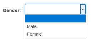
On the surface, this seemed straightforward enough: just use the existing component from the staff side of the application on the doctor-facing side. However, when looking at the existing component, something quickly became clear:

These are not the only genders.
Male doctors are overrepresented in almost all fields of medicine, however I was surprised to learn that the specific specialty that this board certifies is even more overwhelmingly male (>90%) than the tech industry (80%) — that’s saying a lot.
Our user interfaces say a lot too, in both what they do and don’t show. As a non-binary individual, how must it feel to constantly be offered only two options, neither of which are entirely correct? How can we make our application more welcoming to anyone using it, regardless of how they identify?
I will admit, I was a little nervous at first to push back on the details of this otherwise trivial feature. Luckily, after sharing some research, the client seemed amenable to the idea of expanding the options.
This article provides a lot of great points, and contains numerous examples of different UI patterns for requesting information about a user’s gender. A quick summary of things to think about:
- Are you asking for biological sex, or gender identity? These are different things!
- If you don’t absolutely need to know, don’t ask at all.
- If you do need to know, let them know why, and how the information will be used.
- If you just need pronouns (he/him, she/her, they/them, etc.) or honorifics (Mr., Mrs., etc.), ask for those instead.
- Make the question optional, or provide an opt-out option.
- Expect (and design for) a wide variety of responses.
- Try to avoid implied hierarchies.
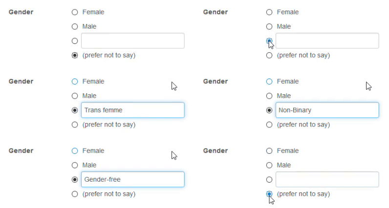
I went through a couple iterations of mockups and wireframes, getting feedback from the client as we went, and am happy to report that our new custom gender selector went live in September.

The new UI makes the question optional, and provides a one-click path for several cases, while also including simple flexibility for everyone. It admittedly doesn’t check all the boxes mentioned above, but it’s a step in the right direction of allowing people to identify as they see themselves, which helps provide a more welcoming and inclusive environment.
Want to be alerted when we publish future blogs? Sign up for our newsletter!