Data-Driven User Experience Improvements
Enterprise software often gets a bad rap from a user experience (UX) perspective, but not without good reason. When heavy focus is placed on the business’ ability to get their job done “ASAP,” features frequently end up with rushed implementations, and systems often end up with “kitchen sink” user interface (UI) design, where the continual addition of “just one more thing” slowly turns into jumbled forms with dozens of fields.
When Corgibytes inherited development responsibility for a small enterprise software system in 2017, as we often do, we started with a Code Inspection. While researching and initially working with this application, it became clear that we also needed to include the UI and UX needed in our discussion of the codebase. Users described the system as “clunky” and complained about needing to click around too much trying to find what they were looking for. Indeed, there was so much data being displayed on every page that it was hard for important information to surface.
Exacerbating this problem, a common theme within organizations who rely on custom legacy enterprise software is an aversion to change in those systems. The application “works” inasmuch as users can complete their daily tasks, and nobody wants to risk messing with that, especially a new consultant. So we had to start small: pick a single page that’s not part of a critical workflow, and prove that these sorts of UI/UX changes can a) be safely made, and b) actually show an improvement.
Starting Small
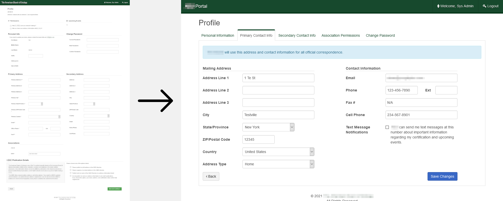
Before our update, a user’s “profile” page contained everything from their full name, home and office contact information, their professional associations, data sharing / communication preferences, and the ability to change their password, all within a single form. Our hypothesis was that rarely does a person want to update all of this information at once, and so splitting it up into meaningful sections would allow users to find the fields they needed to update faster, and therefore let them get on with their day sooner.
Adam Silver — who literally wrote the book on web form design — has a case study that gives a lot of good reasoning behind why splitting up disparate sets of information leads to a better user experience. So our plan was to take the Domain-Driven Design concept of bounded contexts, and split the giant form up into separate tabs: one for each type of information being captured.

Analytics showed that users previously spent an average upwards of 2 minutes editing their profile, every time they visited the page. Once our update was deployed, that time dropped to less than 30 seconds; an improvement of almost 5x. We could also see from the analytics data that our hypothesis was correct: in the vast majority of cases, users only ever edit a single part of their profile, and therefore by allowing them focus specifically on the information they wanted to update, we helped them get their job done faster.
Next Steps
Once we had shown that we could safely make these sorts of UI/UX improvements, we expanded our scope from a single form to a larger workflow.
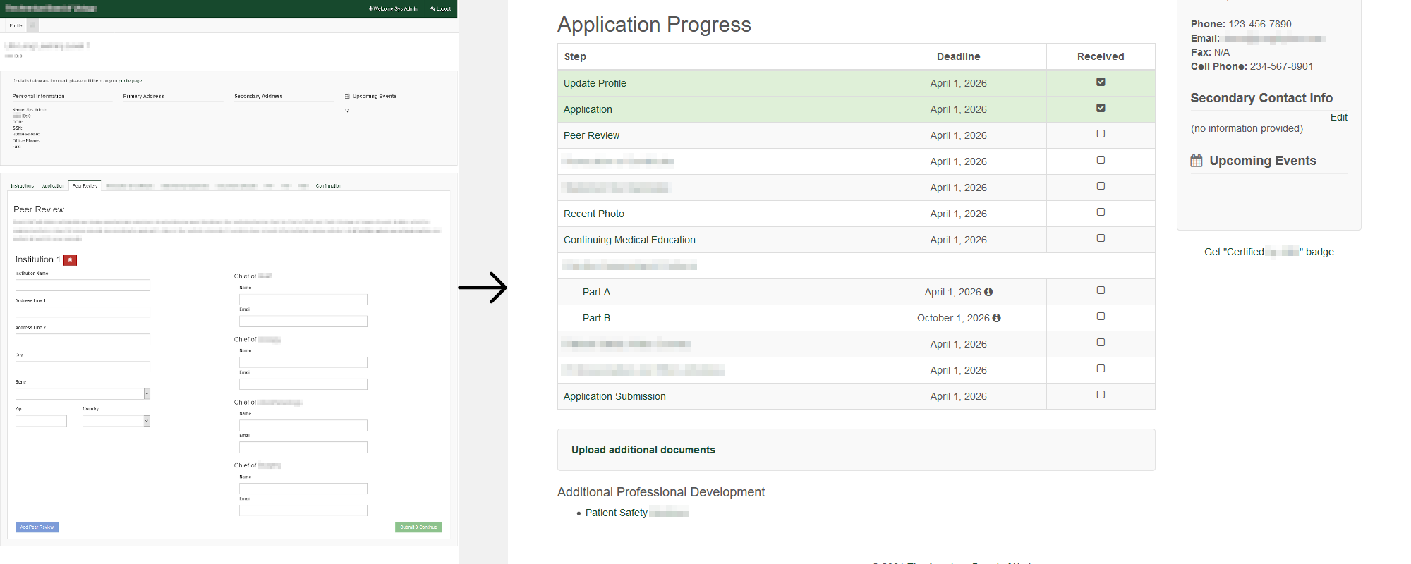
In this particular system, users need to complete a series of administrative, compliance-related, and professional development tasks throughout a calendar year. The difficulty was, when logging in potentially months later since their last visit, there was no way for them to quickly be reminded of their progress, where they left off, and what to do next.
Our plan here was to create a “dashboard:” a single table that showed the users all of their requirements, when they were due (color-coded by urgency), and whether they had already been completed or not. This way, they wouldn’t need to click through the forms to determine what was and was not filled out already.

Similar to the profile update, no new information was being collected here; we were just changing how information that we already had was being displayed. And again, following our profile pattern, the analytics data before and after showed success: from users taking almost an hour to complete their entire application, down to just over 30 minutes, their speed nearly doubled.
The Big One
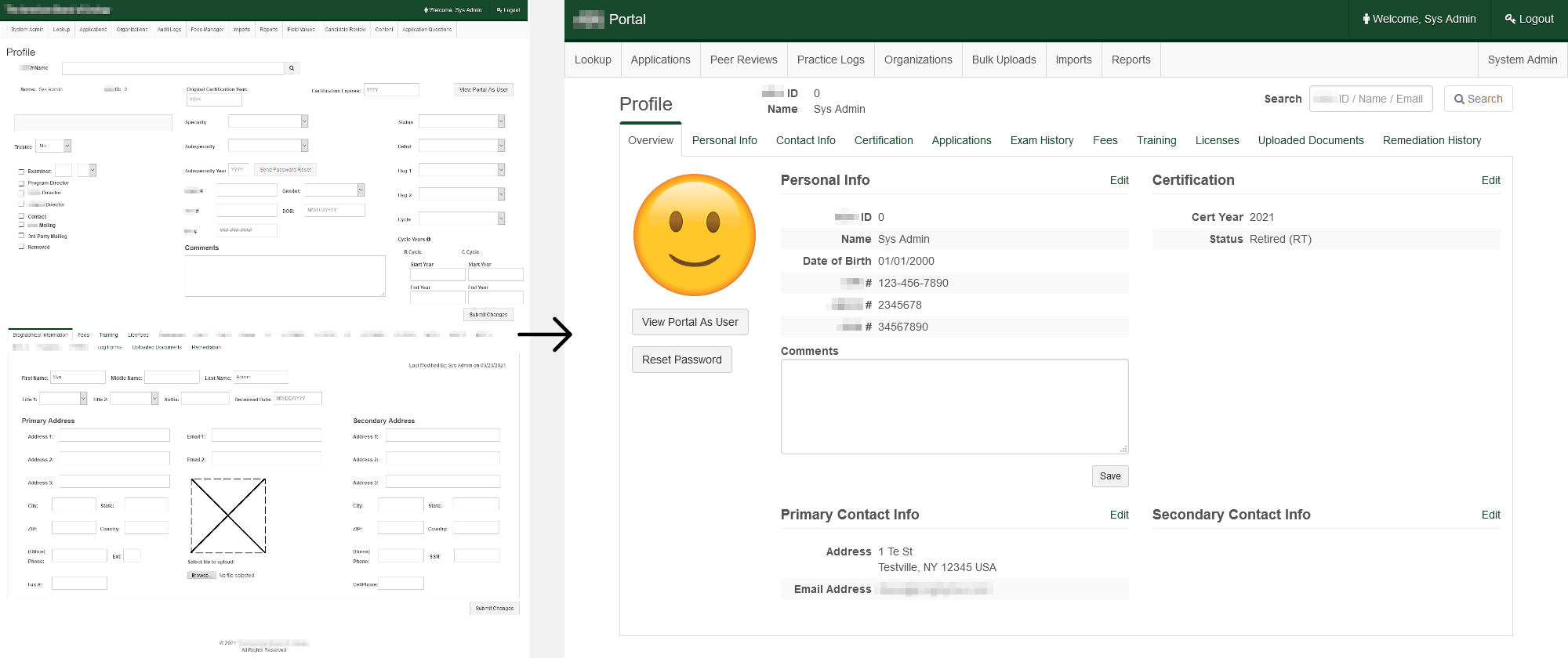
Taking a customer-centric approach, we had prioritized maximizing our client’s users’ productivity, but there was still a large part of the system that needed improving: the area that the client’s staff used; the “back office” side of the system if you will. Staff have their own administrative view of everything the users enter, to review and approve users’ medical board certification and recertification documentation.
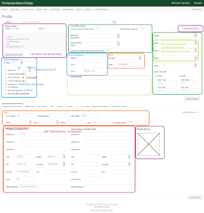
Years of uncontrolled growth and entropy from repeatedly adding “just one more thing” had left certain pages with more than 100 input fields on them, and no connection between groups of related data. Similar to the users’ profile, there was no way all of these ever needed to be updated at once, so we took a similar approach of splitting the information up into relevant tabs. The one difference here was that staff did still need to have a “10,000ft view” of the user’s information, which we accomplished using a read-only “overview” tab, which had easy “edit” links to each of the relevant sections’ forms.

Because this was a much more fundamental overhaul, with a more dedicated group of stakeholders, we needed to tread lightly here and take our time planning and executing this change. The feature had been in the roadmap/backlog for more than a year, and the process from from planning to deployment took 8 more months on top of that, through several iterative rounds of feedback and tweaking.
The initial response was extremely negative, and basically amounted to “everything’s fine where it is, so why change it?” This viewpoint unfortunately doesn’t take new users into consideration: how long would it take before a new hire became comfortable in such a complex system? Our data was limited here, but it seemed like the answer was “months.” Luckily (actually, luck had nothing to do with it) we had already made two major UX improvements with measurable positive impact we could point to.
In addition, this was admittedly a large investment for “no new functionality,” but for staff who use the system all day every day at work, despite their initial hesitance, this type of improvement in their productivity has quickly paid for itself. Over the 5 months since going live, staff have seen a 24% increase in their efficiency using the system, which adds up to 20 minutes per day for each staff member. That’s 20 minutes every day that each person now has to spend on more important things than navigating through a less-than-ideally organized computer information system.

What’s more, reorganizing the complex forms also led to a much cleaner and less complex codebase, as simplifying the UI allowed for data persistence logic to also be greatly simplified, since each page was now only responsible for a smaller number of data objects. This, in turn, also improved performance, as the system was no longer doing an order of magnitude more I/O than was actually necessary.
It should be noted that these sorts of changes cannot be made quickly. In fact, each of the 3 updates above took place during different years: 2018, 2019, and 2020 respectively. Changing the UI too frequently, even if individual changes improve UX, can actually have a detrimental effect long-term, as users can more easily become lost/confused/disgruntled at the constantly-shifting landscape. Slow and steady — deliberate — wins the race here.
Pushing back against the entropy of organic growth, whether we’re talking about a codebase or a UI, isn’t always easy, and sometimes requires dedicated effort, but in the end, everyone wins: happier users, happier clients, and — due to less complex logic and cleaner code — happier developers.
Want to be alerted when we publish future blogs? Sign up for our newsletter!